- How to determine a good color balance
- Known features and processes
White balancing by known features and processes

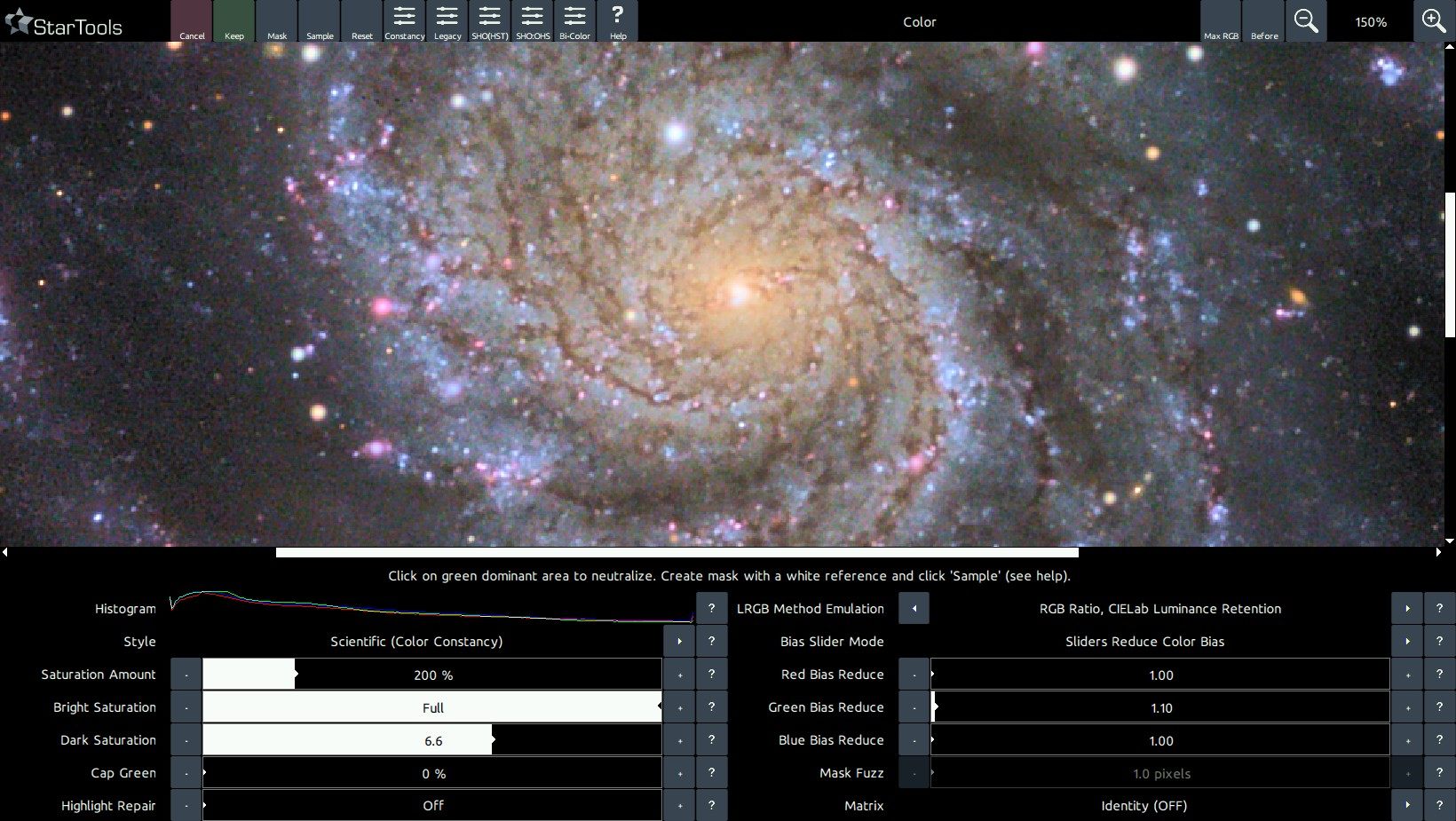
StarTools' Color Constancy feature makes it much easier to see colours and spot processes, interactions, emissions and chemical composition in objects. In fact, the Color Constancy feature makes colouring comparable between different exposure lengths and different gear. This allows for the user to start spotting colours repeating in different features of comparable objects. Such features are, for example, the yellow cores of galaxies (due to the relative over representation of older stars as a result of gas depletion), the bluer outer rims of galaxies (due to the relative over representation of bright blue young stars as a result of the abundance of gas) and the pink/purplish HII area 'blobs' in their discs. Red/brown (white light filtered by dust) dust lanes complement a typical galaxy's rendering.
Similarly, HII areas in our own galaxy (e.g. most nebulae), while in StarTools Color Constancy Style mode, display the exact same colour signature found in the galaxies; a pink/purple as a result of predominantly deep red Hydrogen-alpha emissions mixed with much weaker blue/green
emissions of Hydrogen-beta and Oxygen-III emissions and (more dominantly) reflected blue star light from bright young blue giants who are often born in these areas, and shape the gas around them.
Dusty areas where the bright blue giants have 'boiled away' the Hydrogen through radiation pressure (for example the Pleiades) reflect the blue star light of any surviving stars, becoming distinctly blue reflection nebulae. Sometimes gradients can be spotted where (gas-rich) purple gives away to (gas-poor) blue (for example the Rosette core) as this process is caught in the act.
Diffraction spikes, while artefacts, also can be of great help when calibrating colours; the "rainbow" patterns (though skewed by the dominant colour of the star whose light is being diffracted) should show a nice continuum of colouring.
Finally, star temperatures, in a wide enough field, should be evenly distributed; the amount of red, orange, yellow, white and blue stars should be roughly equal. If any of these colors are missing or are over-represented we know the colour balance is off.
